Bestseller, Author & Illustrator; Tony DiTerlizzi
You will love his artwork!
He answers a few of my compelling questions;
Q. What sizes are your final images:
A. TD: Most of the time, my rule is to render an image 200% larger than it’s final printed size. But there are always exceptions: Most Magic cards are 11 x 14″. Some book covers can be as large as 20 x 30″.
Generally, most of my paintings are around the 15 x 20″ size and I usually gauge it by the size of the focal point in the image. In other words, I ask myself if, at 200%, this focal point is too small for me to get in there and render? If it isn’t, I enlarge the image until I am comfortable with the working space.
Q.Who are your artistic influences?
A.TD: This answer would be a very long list. But there are a few who really stand out that really affected me:
Arthur Rackham, E. H. Shepard, Norman Rockwell, A.B. Frost, Jim Henson, Beatrix Potter, W. Heath Robinson, Dr. Seuss, Edward Gorey, Harry Rountree, Maxfield Parrish and J.C. Leyendecker all come to mind as major inspiration to me and my work.
“Okay, okay,” you say. “But how about someone that’s alive and current?” Well, I have lots of favorites that are out there making art as you read this. Folks like:
Brian Froud, Alan Lee, Mark Ryden, Scott Gustafson, James Gurney, James Jean and Moebius are a few artists who have inspired me.
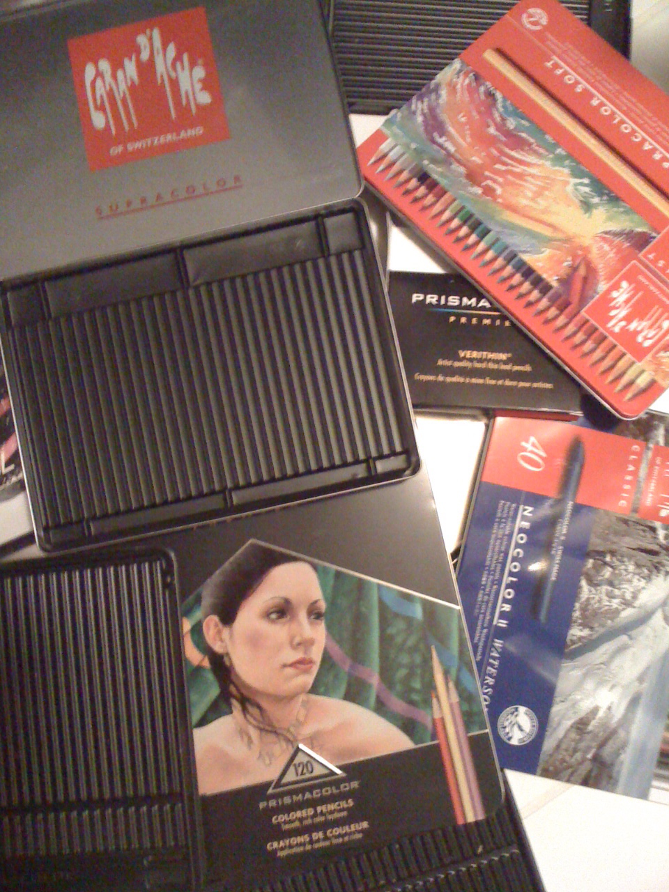
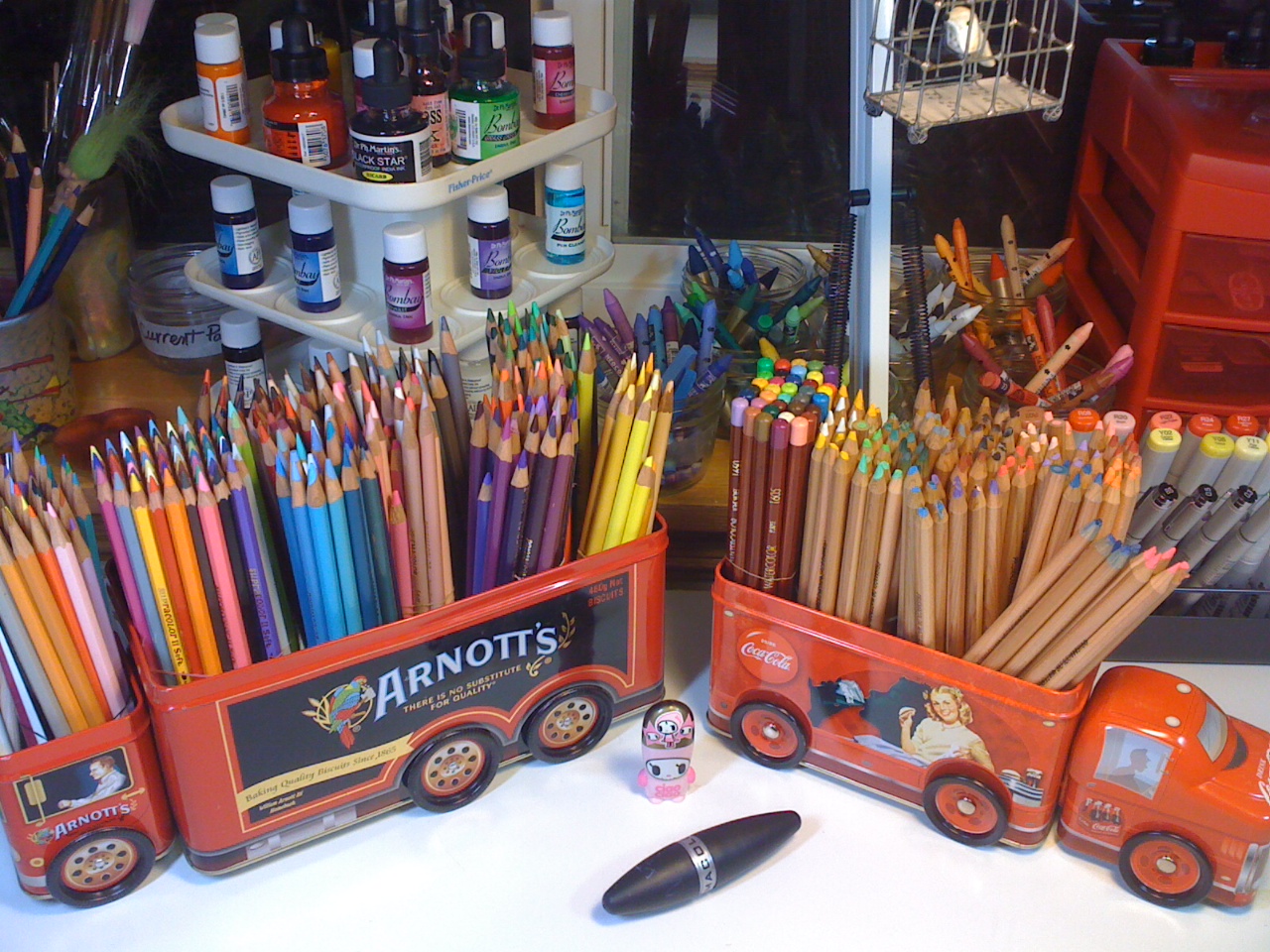
Q. What Medium(s) do you work in?
A. TD: Always on a path to further my understanding of art, I have worked with quite a few mediums. Here are some that you may be familiar with:
1992—1993: The Dungeons & Dragons books: Were permanent ball-point pen on laser bond paper. They were colored in alcohol-based graphic markers and detailed with colored pencils. I had no money at the time, and a lot of leftover art school supplies.
1993—1996: The “Planescape” years: Understanding mediums comfortable to my evolving style, I moved into working on both cold and hot press Bristol board (which I would purchase by the pad).
I upgraded to inking my work with dip pens (preferring the Hunt 102 nib and sepia FW inks). Images were then colored in watercolor and diluted FW inks, which were also run through an airbrush. Details were then added with Berol colored pencils.
1996—2003: Magic cards, Magazine covers and my first books: For my painterly stuff, I work with Holbien Acryla Gouache on Strathmore 3 or 4-ply plate Bristol. Sepia or Dark Umber Berol Prismacolor colored pencils are used for layout and detailing.
Pen & ink work is either done with the FW inks or Pilot microball pens. I no longer use an airbrush. Preliminary sketches are done with a standard #2 pencil.
2003–present: Children’s books: Nowadays, I use whatever medium will help me create the finished book I see in my mind. From The Spider & The Fly onwards, I started using Photoshop to help clean up my preliminary sketches and to fix minor errors in final paintings.
I must say that my preferred mediums have evolved organically over years of trial and error. As an artist, you must expose yourself to as many mediums and art styles as you can to seek which work best for you.
Q. I want to break into illustration, now what should I do?
A. TD: If you don’t know, I started out as an illustrator before I evolved into a children’s book author and illustrator. I illustrated many fantasy game products like “Dungeons & Dragons” books and “Magic the Gathering” collectible cards. This led to illustration work for book covers and magazines. All the while, I was honing my storytelling ability to become a children’s book creator.
I was very overwhelmed with the prospect of finding work when I graduated art school back in 1992. One thing I soon realized I lacked were people skills and an understanding of business etiquette of breaking into the field of illustration. I contacted some established artists in the field and asked a lot of questions, which helped greatly. So, if you were to contact me, here are some basic points that I think may help a recent art school grad.
(Obviously, these suggestions are based on my experiences and may not apply to all. Consider them starting points for entering the field professionally.)
YOUR PORTFOLIO
“Create what you like”
If you like to draw caricatures, and want to get work doing editorial illustration, don’t put your fantasy drawings in your submission portfolio. Have a focus of subject matter and illustration type.
This goes for mediums as well. If your desire is only to paint in oils, don’t put your pen & ink piece in your portfolio: chances are that’s the one style they’ll pick.
I remember a friend of mine who excelled at watercolors, but did a real nice pen & ink pointillism piece (for a school assignment) that took him forever to complete. Though he was happy with the results, they did not come easy or quick to him. He added it to his portfolio anyway, and guess what his first professional job was? A pointillism piece.
So draw subjects that you like, and play up your strengths.
“Less is more”
I’d rather see 10 amazing pieces of art than 15 with some mediocre images in them.
As for adding sketches to your portfolio, it’s a mixed bag: Some art directors like to see sketches, so they can see your thinking process, others may confuse them for finished pieces. If you really want to include them, your best bet is to do so as a separate section from your finished work.
“Apply your skills”
How will your art look in their magazine? How will it look in a book? In a game? Mocking up tear sheets is a great way to show how your art will work with their product. Don’t just show them your final art floating on a background, place it on the end product to make it easy for the client to visualize working with you.
If it’s illustrating books you are after, make sure there is a book dummy enclosed, along with a few finished images from the dummy.
“Leave the goods”
I don’t know if art directors even look at a physical portfolio anymore. They take up a lot of space and are a pain to pack-and-ship. My best advice nowadays would be to create a nice postcard or brochure pointing the art director to an online portfolio. Keep the website clean and easy to navigate showcasing your work and a client list.
What I did back in the late-1990′s was created several portfolios (with color printouts/laser copies) that could be left with potential clients. If the portfolios came back, or were rejected, I sent them to the next potential clients. If they kept them, or I heard otherwise, I assumed they were filed. From there, I would periodically send updated images (prints, postcards, etc.) to keep my name fresh in their minds.
PEOPLE SKILLS
“Breaking in”
Breaking into the field is the toughest part. For me, Angela and I moved to New York City, and I solicited my work for about a year. Prior to that, I sent in numerous mailed submissions. But how did I figure out where and who to send my portfolio to?
First I figured out where it was I thought my work might have a chance of fitting in. And I tried to keep my goals realistic: I knew I wasn’t going to get my own children’s book series fresh out of school. I liked drawing fantasy stuff, so I thought sending my work to the publishers of the “Dungeons & Dragons” game was a worthy try.
Since I really wanted to create children’s books, so I started submitting to different publishing houses as well. I went to bookstores and looked at publishers who were publishing books that had similar themes to the work I was creating, not just in art, but story content as well.
As for getting the addresses of where to send my samples, most every publication lists their address somewhere on their product, just look for it. And, for getting an art director’s name, you can try contacting the publisher and ask for their submission guidelines and who to send it to.
When I could, I tried to drop my portfolio of samples off in person. Even if it meant I had to make travel plans to meet the client (most are in New York City, so prior to moving there, I often stayed for a period of time, meeting with as many as would have me).
An art director meeting a potential illustrator is no different than meeting a potential friend—if all goes well, you will be entering a working relationship together, and it is good to get a sense of each other. Also, the quick contact could prove to create a memorable moment (something in common for instance) that may have you stand out amongst the hundreds of other people they meet and interact with.
“Following up”
When does a friendly reminder to an art director become an annoyance?Answer: pretty quick if it is done incorrectly.
The art directors I know are always busy. They are handling multiple projects, with multiple deadlines, and are working with multiple people all at once. Theirs is a very intense job. Therefore, dropping an email, or phoning up repeatedly can sometimes damage your chances.
If you’ve submitted work and haven’t heard back in 30 days, there is a good chance that they haven’t even seen your portfolio yet. Most art directors get numerous submissions a day and up to hundreds in a week!
So a friendly reminder can consist of a new postcard, a new tearsheet, or new personal piece, with a reminder that they can see more of your work on your website.
“Don’t call them, they’ll call you”
HOWEVER, many art directors do have assistants or secretaries. I found that talking with them (many recent college grads, by the way) got me much more information as to what to send and when to send it, while leaving the busy art director alone. If you contact the publisher for submission guidelines, ask if you can get the art director’s assistant’s name as well, that could be your one chance in.
Lastly, don’t give up. I was rejected many times with my artwork and ideas. But with each rejection my resolve grew stronger, my portfolio grew stronger, and I became more focused on what I really wanted to do with my art and my career. If it is something you really want, keep at it—you’ll get there.
_____________
LJ: Wow, This has been great Tony, very useful!
Thanks so much!
_____________
To view more of his Q. & A.